Fonts You Should Stop Using Right Now
A few months ago I had dinner at a relatively decent mom and pop Chinese restaurant. At least I thought it was decent until I glanced at the giant banner on the side of their building with the restaurant’s name (don’t ask me how I missed it going in) in which their font of choice was the Disney font. Disney.
While the food was amazing and I’ll definitely be back for more, bad fonts are just gross. They make your skin crawl. They stare at you, daring you to look away without shuddering. When a restaurant uses a bad font for their logo or menu it’s more damaging to me than a terrible waitress. When a company uses a bad font I feel slighted, like they’re telling me they hate my profession. Do they not value marketing because they neglected to hire a respectable graphic designer – someone who works with fonts 15 hours a day and knows which ones to use and avoid, and how to pair them? Or maybe they’re novices who don’t know better but make killer Chinese food. So if you’re new to this, pay attention so you don’t look like a rookie.
I consulted with my team and we came up with a list of fonts to avoid. We’re going to tell you what fonts hurt our soul and haunt us at night so you can stop using them. Right. Now.
NOTE: Serif vs san-serif fonts. What is a serif? It is the little line or projection that comes off of a stroke on each letter. San-serif fonts don’t have those little flourishes (sans coming from the latin word sine meaning “without”).
First and foremost, Papyrus.
Watch this video and then maybe you’ll understand how painful it is to see bad fonts being used. Plus, Ryan Gosling.
2. Comic Sans. For me, Comic Sans is the worst font ever. It should be dropped off a very high cliff, but even then I fear it’d prove too resilient to die. Comic Sans is childish, trite, silly, and awful. Please don’t make me talk about this one anymore. Just don’t use it.
3. (Not a font, but good advice) Never use emulators. We all love Disney and Diet Coke, but using knockoff versions of their fonts doesn’t add validity or depth to your brand. It will absolutely do the opposite. Dafont.com has its (few) uses, but emulating fonts from popular brands is not one.
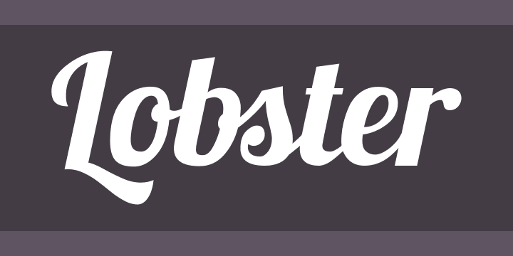
5. Lobster. Ew. It’s the new Comic Sans. This cutesy font may look innocent but it’s a sneaky travesty waiting to sink its claws into your brand.

4. Gill Sans. Here we start a new tier of fonts that don’t make us sick to our stomach, but that are WAY overused. My designer can’t bear to look at this one anymore. Gotham, sadly, is heading down the path of fonts that were so popular everyone else loved them too and now looks a little used up. This happened to me in the ’90s with the song Brick by Ben Folds Five. Radio stations played that great tune into the ground and it’s only been in the last few years that I’ve been able to start listening to it again.
6. Hobo. This font is most likely named after the Russian word for new. It is unique in that it has no straight lines or descenders – which makes me want to punch it in the (type)face. Take a moment to imagine a font with no straight lines. It is an older font that’s making a comeback. Please don’t use it – we don’t want it back.
7. Copperplate. This is part of a big font family that features tiny little serifs. But if serifs are your thing, there are so many other options! Better options! Copperplate tries too hard and your brand should not look like it’s trying too hard.
8. Calibri. I know you like Calibri. You like it for your documents and your resumes and your emails. This sans-serif font is the default font for Microsoft and their answer to Arial or Helvetica, but it is BORING. Sure it’s easy to read, for 5 minutes until you fall asleep from just looking at it. It’s unoriginal and banal. And is that what you want your company known for?
9. Our Last Font You Should Never Use is Trajan. i.e. the West Wing font. We love The West Wing, but that doesn’t mean we or you should ever use the Trajan font. This tacky, romanesque, serif font this the last thing you should use for your brand if you want to be taken seriously.

Ok, so there you have our top fonts you should never use. If I missed your favorite putrid font, let me know which one! As much as we hate certain fonts we love to talk about the fonts we hate.

